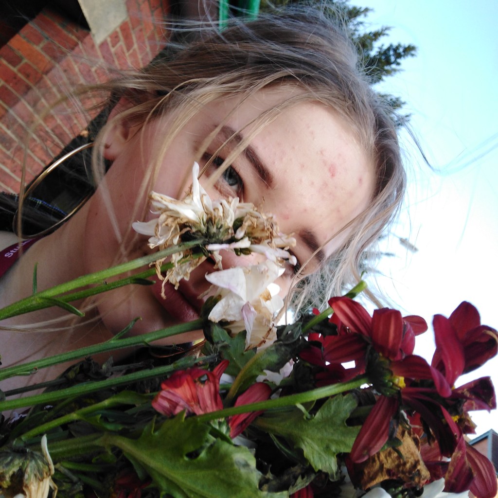
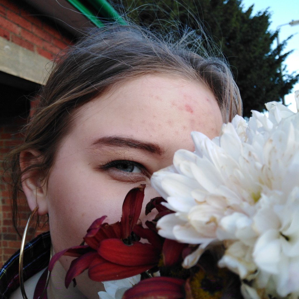
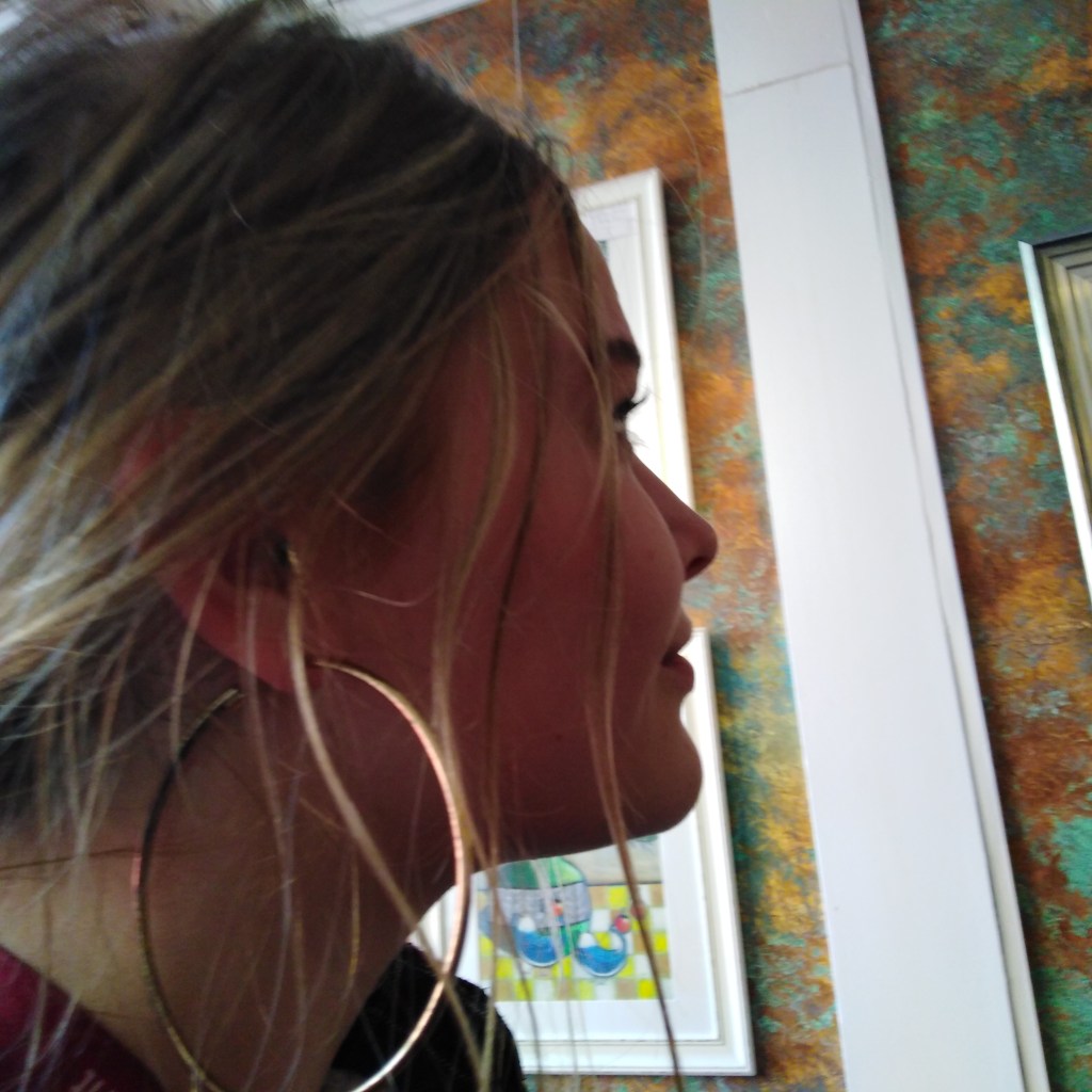
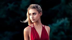
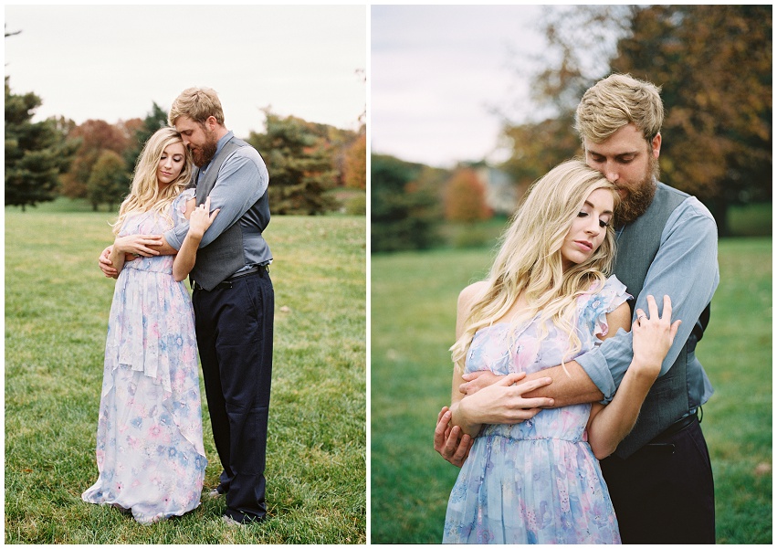
A shot took of Emily, by using the flowers I wanted it to cover part of her face yet showing specific features that most stand out like her eyes to make the portrait seem more mysterious.Again using the flowers for this portrait shot but drawing more attention to the eye, i believe the contrast of the red and white flowers together helps bring in focus to her eye and almost frames it in a way however i feel as though it would of suited better if i got more close up and captured just the petals around her eye.We went to an art gallery for this shot and when taking a look around, I noticed the background wall covered in earthly warm spatters of paint, which I feel contrasted well with her skin tone and outfit and gave the protrait shot a artistic atmosphere. Could of been much improved if i got a bit more of her side profile face to make it more of a proper portrait shot.
When doing portrait shots, I wanted to focus upon not completely portraying all of her face but taking pictures of certain features to combine a sense of mystery which should make the viewer look more into the image to try and make out of the shot.
Landscape photography:
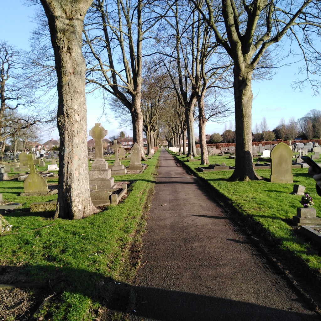
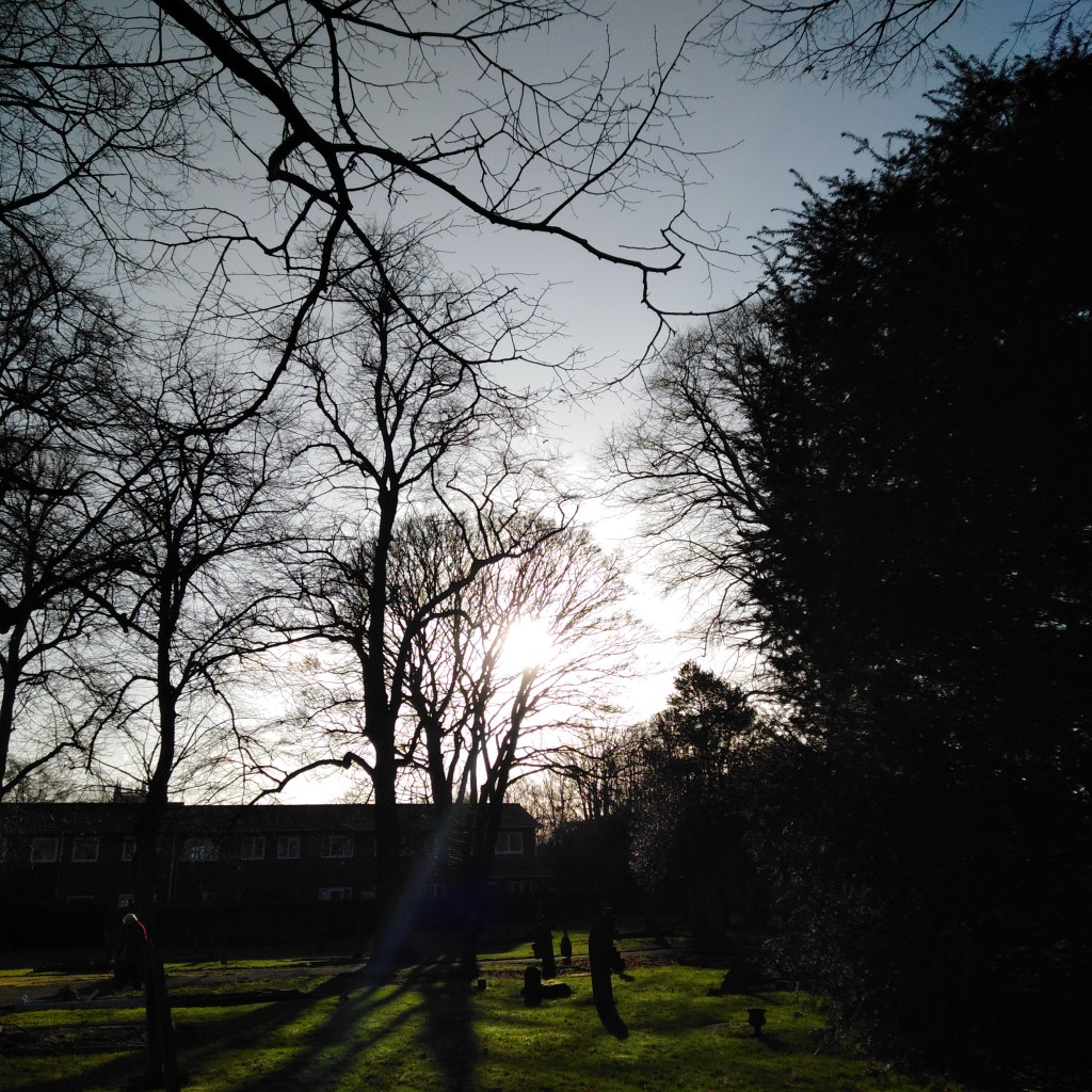
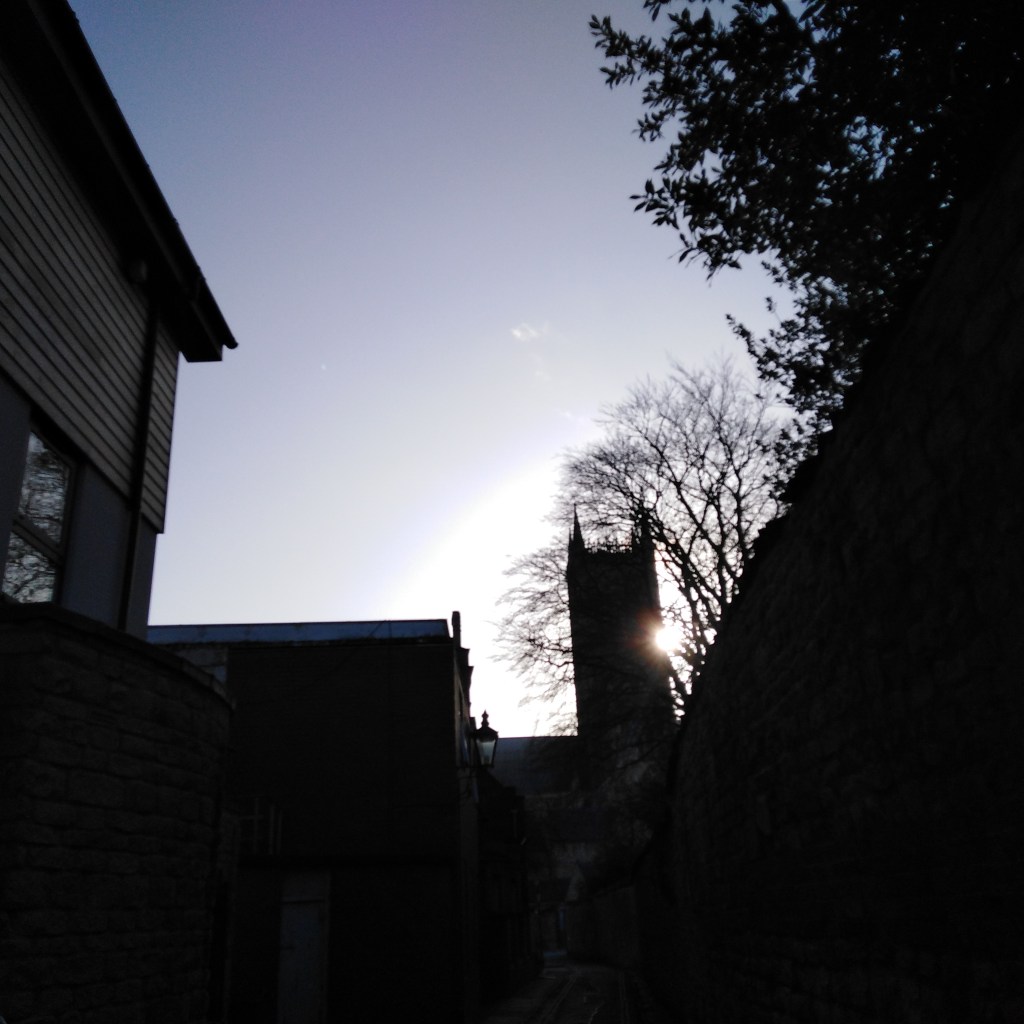
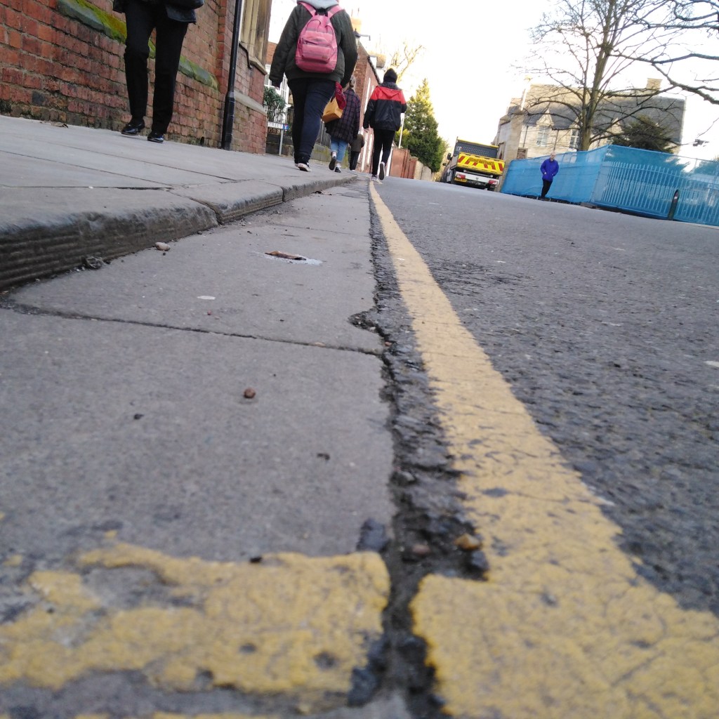
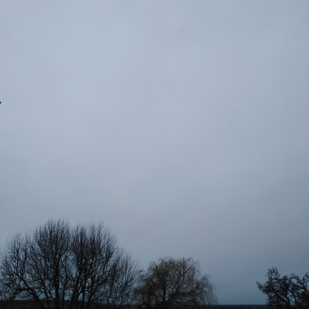
A landscape shot that includes leading lines. I feel like the shadow play and gleaming sun helps emphasize all the different subjects within the shot to make it a landscape.In this landscape shot, there is a lot of silhouette effects with the trees, branches and bushes leaving bright green of the grass to reflect at the bottom with casted shadows and a pale blue at the top of the sky. I feel as though the branches frame the landscape shot.Again like the previous image, a lot of silhouette effects are taking place, with the sun making an appearance from the side of the building. I feel like it’s somewhat more of a close landscape as there isn’t much to explore within the image. Again another leading line, but more of a close-up landscape shot of it. The line leads onto the people walking and the vehicles and buildings ahead. It allows a wide eye view of everything surrounding in the image.
Landscape photography is one of the main genres of photography and there are so many different landscape shots you can take, personally i don’t usually take landscape shots but after trying it out better for this part of the project, I find that i am wanting to now take more landscape shots in the future and focus upon it better.
Product photography:
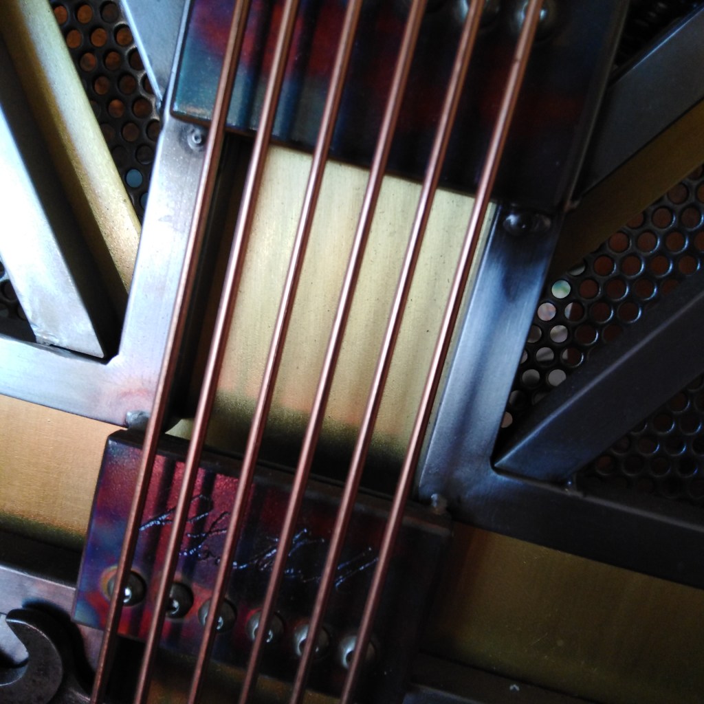
Close up shot of a guitar found in an art gallery, can be seen as product photography due to focusing on what is is and the details that stood out to me most, for example; the strings and the writing beneath it. I am drawn to how abstract it came out as and how its framed with no other space around it except the main guitar itself.
Product photography i’d say isn’t that common of a photography genre, but it’s something i adore doing because i love how you can focus on that one main subject and place whatever else you want in it to make it more aesthetically pleasing to the eye, or focus upon the small details that stand out to you first and what you see the project as, like i tried to do with this shot above.
Nature photography:
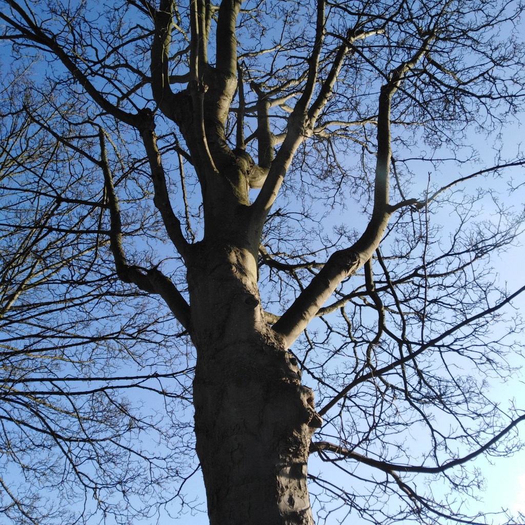
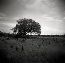
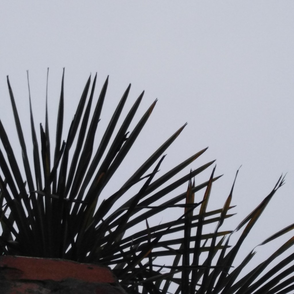
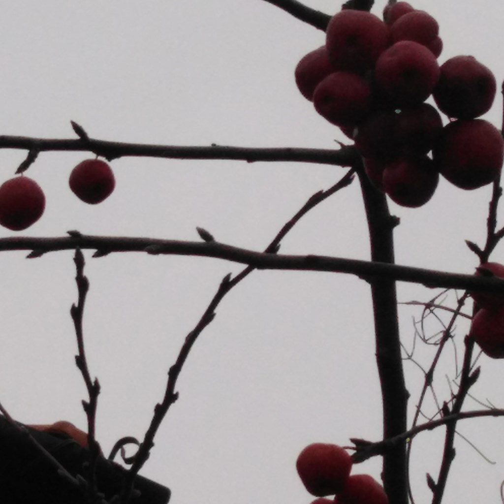
Nature photography due to the complete focus of the tree with negative space surrounding of the blue marine sky, I find the way that the branches strike out all around the image and leave the main part of the tree as satisfyingly pleasing to the eye and shows how tall and superior the tree is.
Nature photography again like landscape photography is one of the main genres in photography, I find that it’s easier to angle things how you want others to perceive it as with nature photography, especially for flower shots.
Close up form of an Urban landscape:
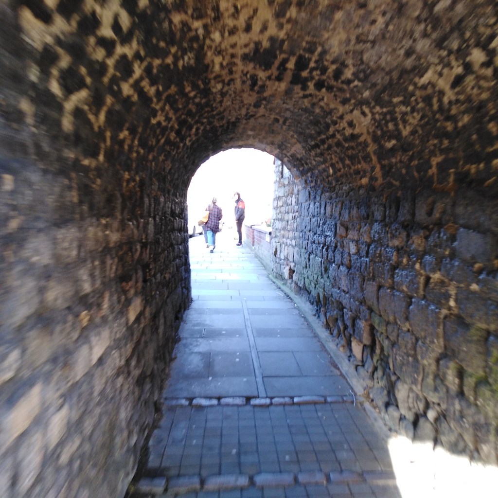
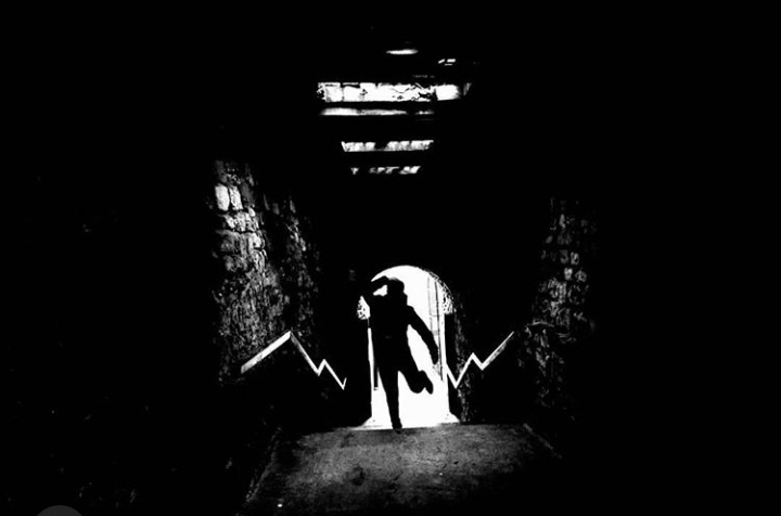
The reason this image wouldn’t fit into a normal landscape shot, is that its more or so a close up form of an urban landscape, as its focusing on the experimentation of texture due to the brick wall, the blur at the start of the wall leads you in to look at the rest that is sharpened out and really shows the texture of it all then leading to the end of the tunnel showing a blur of two people in bright white light which makes the shot stand out better,
Urban landscape photography, can help you focus on industrial subjects and the manmade objects which is a great way to look at the texture and shapes of it, and is one of the best genres for that along with macro photography.
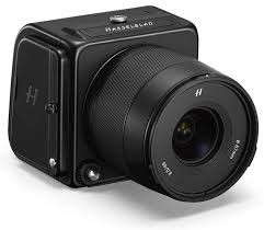
“Victor Hasselblad AB is a Swedish manufacturer of medium format cameras, photographic equipment and image scanners based in Gothenburg, Sweden. The company originally became known for its classic analog medium format cameras that used a waist level viewfinder.”
Hasselblad cameras are known for costing a great expense of money, the 200 Megapixel Hasselblad camera costing $45,000, but because of such a big amount of money, apparently its due to producing incredible 100-megapixel shots.
“This camera is bigger and more demanding than most, but its also far smaller and easier to operate than anything else with a sensor of its size.”
When taking a look at the genre that people prefer to follow when taking pictures with this camera, it seems to be a lot of portrait photography going on. I believe it’s most likely due to it being sharp focus on the main subject (the model) and blurs out the background which is always super satisfactory for portrait photos.
Here’s some examples of portrait photography that people have took using the camera:
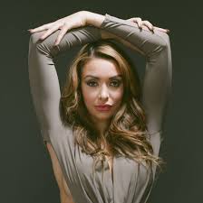
Here you can see by using the Hasselblad camera it draws all attention the model instantly blurring the background. It concentrates on every small amount of detail upon her which makes the shot seem bold and independent.
Again it gives a super similar effect to the first example I showed, it blurs the dark green background and pulls in on every detail of the model. It’s perfect for creating a statement and a strong fierce almost mood, as it seems to bring out every single models personality due to the sharp focus on all of the model.
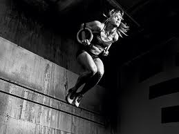
Here they used the Hasselblad camera to capture the model in motion which it clearly has done perfectly and it’s even better in black and white. It captured every sense of mood due to again all of the model being in focus so here you can see she is determined and willing to do what it takes.
Instagram currently one of the main leading apps, has become incredibly successful since it’s release date on 6th October 2010. As it came from rising up from those years, they wanted to improve the app and make it more advanced for everyone to use, so they often do yearly check-ups of what might need updating and changing. In 2016 Instagram designed a new logo by the help of Kevin Systrom and Robert Padbury, they wanted it to be something the world could easily remember and picture, which they managed to do; when it first came out people weren’t so sure upon it but now since the logo update, over a billion people are now using Instagram 2 years after the new Instagram logo, not only was it due to the logo but because of adding more content like stories and story highlights and making the navigation a lot easier for everyone.
Old Instagram Logo VS The New Instagram LogoThe co founders of Instagram
Square format cameras have been around a long time, since approximately 1930. With square format, a square is a perfectly balanced shape, which means that using the square format encourages the viewer to look around in the frame of the image in a circle. Comparing this to regular frame, it will encourage the viewer to move from side to side in (landscape photography) or up and down in (portrait photography), however not in a circle as a whole. To me square format allows focus on each part as you are looking around in a circle in the frame of the shot which is why many photographers may choose to do closeup shots of pictures such as; flowers, leaves, specific little features that really allow the viewer to acknowledge the whole of the subject.
Square format also carries a lot of simplicity, as using square format gives less space which keeps the composition simple, and gives a stronger image as you are “almost forced” into the image, focusing on the main subject that the photographer wanted you to notice.
Personally, I feel as though square format, is much easier to use than rectangular format as you are more able to make the main subject of the image stand out. But I’d say that rectangular format is great for landscape photography cause they get to move alongside the image seeing (leading lines or buildings in a row etc.)
I feel like square format really helps draw the viewers attention in to the flower, and helps with centering it bang in the middle.
I’ve seen that many photographers use leading lines with square format, and after seeing the effect that it has, I can understand why as
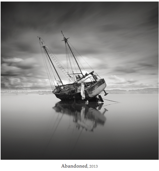
By using square format with this picture, it really draws attention to the tilting boat as it makes it come up as more close and more determined to perceive the boat as the only clear main subject, it really draws us in as the viewer and holds a melancholic sense behind the picture.
. With these pictures took with square format
120mm film
120 film is a popular film format for still photograph. “It was originally intended for amateur photography but was later superseded in this role by 135 film”
You can usually take between 12 and 16 photos on a 120 film roll.
120 film is much harder to find compared to 35 film , meaning that you won’t tend to find it in your local store. 120 film is a bit larger than 35 film, ” the more professional models can be heavy and unwieldy”
The film had also became more popular in the sub-genre of toy cameras. These are cheap cameras, tending to have poor quality, but photographers use the low-fidelity look to gain a certain aesthetic feed.
The first one is took with 35mm film and the second with 120mm film With 120mm film, it makes the shot actually seem more clear and has a dreamy slight blue tinge to it. In which i actually prefer the 120mm film compared to the 35mm film shot in this for being that reason. 120 mm film for this shot gave a more vintage feel to this shot, due to the amount of grain effect in the shot which creates an appealing image to the eye, it helps that they are taking a picture of a fairly large building from ground level through the grass because it gives a historic sense to the photo. Again gives a strong grainy effect and makes this picture of an isolated black and white tree in the fields, seem outdated and like it was captured in an olden era which gives it a aesthetic to the shot.
I found that when using normal format it allowed more space into the shot and made the pictures seem more elongated compared to the square format.
Starting with my first picture (in square format) it seems more like a landscape shot due to the subject being more in the distance and, I feel as though I found it more easier to center my chosen subject by using the square format. When I look at the normal format shot of the same subject, it seems like it makes the houses and road seem more close and wider in comparison to the my first shot. I feel like by using the square format, it made it look more realistic as to how I saw the subject with my eyes, and how i wanted it to be perceived as, so therefore I feel as though i much preferred the square format for this shot and particular shot.
Coming to my second picture, the main subject I wanted the viewer to be drawn to was the house in the background which was why I used the branches and other houses to frame and make the house in the background appear. When using square format for this picture, I feel as though it made it more difficult for the house in the background to stand out, as the square format squished it all in to make the house in the background blend with the others and appear smaller in size, however compared to the one with normal format, it brings the subject more close to the eye and stands out. So i prefer normal format for this shot
Moving onto shot number 3, It seems a lot more close and focused upon the raindrop falling off the branch which is in normal format (I prefer this one) compared to the one in square format which seems more framed and focusing on the branches as a whole.
When viewing my 4th picture, you can see the whole of the light through the window and because of using square format, it focuses on everything as a whole and really draws attention to the reflection on the window as well as the light that is casting on it; compared to the one with normal format, it draws more attention to the main light only. But personally, i find the square format much better as it offers more to the eye in the first shot.
Coming to my 5th picture, I tried framing the main subject of the picture (the light) by using the leaves, however, when using the normal format I found it more difficult to center the light in the gaps of the leaves however with square format, it made it much more easier and stood out better.
Overall, to me, the main difference between square format and normal format on phone cameras, is that square format focuses on bringing things more close and up personal and tends to take the shot as how you perceived it through the eye but when it comes to normal format, it makes everything further in the distance, and makes sure that everything has fitted into the picture, by that, I see normal format as definitely more reasonable for landscape shots, where you want to the viewer to see everything surrounding you, and square format shots are great if you want the viewer to focus on one or two specific things in your picture.
Some other photos I have in square format that were took that day:
A black and white shot, with a silhouette of Callum. The square format really helped with emphasizing and bringing forward the silhouette and making it more clear to the eye and due to the square format it assisted with positioning Callum bang in the middle, giving a good composition. This shot seems really eery and sinister which can draw attention to most viewers.
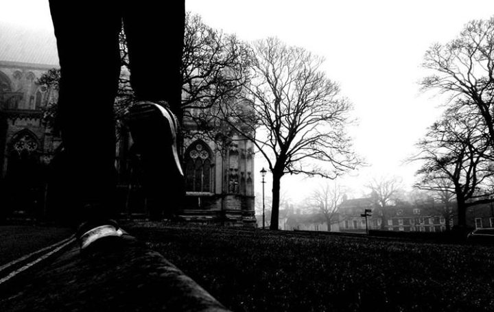
Square format really suited to this shot, which is a ground level black and white view of Callum (again), it helped bring the main subject of the shot more close (the legs) and keeping everything else contained and clear within the image (the background). I admire the misty unknown sense that the atmosphere gives in this shot.
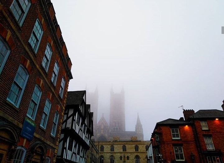
Compared to the shot of this in normal format (unfortunately i lost the image for that one, so I can’t compare) the square format for this shot made the buildings on the left lean in a lot more, yet made everything evenly proportioned in the image and not so abnormal. It helped with the framing of the misty foggy castle in the background, which creates a pleasing image to the eye.
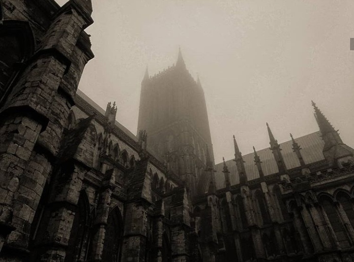
Square format was very useful for compositing the castle so it fit in all around the image, like it was opening up to the viewer so you can see all the different abstract shapes and different heights of each bit it has to offer. I did apply a filter to this shot so it could give it a more vintage and out dated feel.
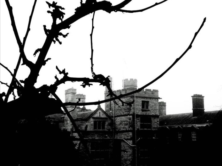
Square format for this shot in particular helped with the elongated twisting silhouetted branches framing the castle. I find that using square format for this helps with the rule of thirds for this also so it makes the shot a lot more appealing to the eye.
A picture without square format:
I feel like when taking pictures in normal format for leading line photos, it makes them turn out a whole lot better as it makes the shot seem more abnormal and allows a whole lot more in the image so it becomes a proper leading line photo. This shot is appealing to the eye for some due to the vibrant yellow line that leads to the misty background with trees and a building.
. Being able to show/hide things using screen options. – I think this feature is quite useful because it allows you to take more control of your website, choosing what you would like the viewer to see.
. Being able to move, add, or delete dashboard widgets. – Definitely helpful , great for business profiles to use on their websites. Not sure if everyone would use it as whole, it depends on the purpose of their website.
. Having the ability to preview themes without activating them – Again, definitely helpful as when you want to choose your theme, you would most likely want to skim through them all until you find the one that best suits and is the one you want to activate.
. Being able to embed links, videos and multimedia – This is useful , especially if you want to show examples of something, or if you are talking about a specific link, video or multimedia. It can help also with expanding your website.
. Small selection of font pairings to choose from – Useful of course for setting your own style to your website, however, would be better if they did more, different fonts that are much different to each other and all hold different styles rather than the same.
Instagram:
. Image editing – Helpful for if you don’t want to download another app to simply edit your photos/posts, also the editing that instagram offers is actually quite easy to use and simplistic, you are able to edit them to whatever extent you want.
. Location tagging – Useful for when you want to show the viewer where the shot was took.
. Private messaging – I’d say it’s somewhat useful but not completely, as there isn’t many purposes with private messaging.
. Stories – Useful and expands instagram more with their entertainment and features.
. Filters – Useful for when you don’t want to go through the whole editing process. There are plenty to choose from , so you can decide which best fits your photos.
. Hashtags – Useful for getting others out there that you don’t follow to reach and see your photos by using hashtags. Able to attract a bigger audience.
My own experience with WordPress so far:
So far with WordPress, i find that i am starting to adjust to their features and beginning to see the variety that they have so I can change everything to the liking that seems best. It seems to be fairly easy when making a website and is very straight forward. I believe WordPress is something that takes gradual time to learn specific areas and tools, but once you’ve grasped it, you can create your own website to the best of your ability.
There is certainly more that I need to find out and some areas that will take time getting used to, such as; finding out how to properly add dashboard widgets, and being able to embed links and images in a specific place.
However, other than that, I am starting to get the hang of it and find that i’m now starting to add my own personal touches and express myself with this website.
My ongoing experience with Instagram:
Personally, I find really easy to use and i’m able to access and make use of majority of their features. I find that features such as filters, which is great way to have edited photos without spending loads of time with editing them yourselves with the whole process and also features like hashtags help grow your Instagram more with followers and getting people to notice your posts and profile.
I have used Instagram for quite a few years since 2017, so a lot longer compared to using WordPress which may be why I am so used to the features and my knowledge of them.
Instagram has been definitely an easy way to post and get my pictures out there along with typing my own personal thoughts underneath; I also promote my pictures sometimes by putting them on my story alongside hashtags, so my followers and others can notice my work.
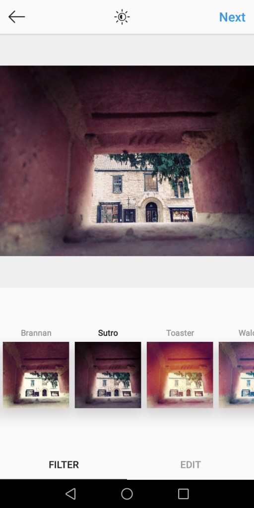
1st picture: The filters brought more saturation and bolder colours into the picture and makes the main focus of the image sharper. With other filters such as “sutro”, it changed the brick wall colouring from a maroon to a lilac pinkish shade. Many of the filters focused on bringing out the green and colouring of the wall and leaves, as well as making the main focus of the image stand out better.
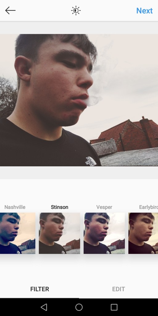
2nd picture: Out of all the filters, the “willow” one was definitely a favorite, it made the picture become a delicate black and white, yet made the atmosphere of the photo more mysterious and sinister. However, the filter “stinson” focused on bringing out the pastels of the pictures, whereas the “1972” filter gave a retro atmosphere with making the sky green.
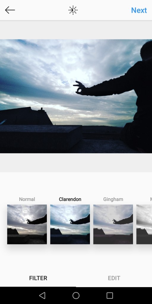
3rd picture: Filters such as “x-pro11” and “Clarendon” changed the complete colour of the sky, the “x-pro11” which made the colours more of a deeper blue and golden yellow. With “Clarendon” being more of a turquoise blue. My favorite filter had to be “lo-fi” because it’s more natural, yet gives the sky a bit of a blue purple tinge and golden at the bottom of the sky.
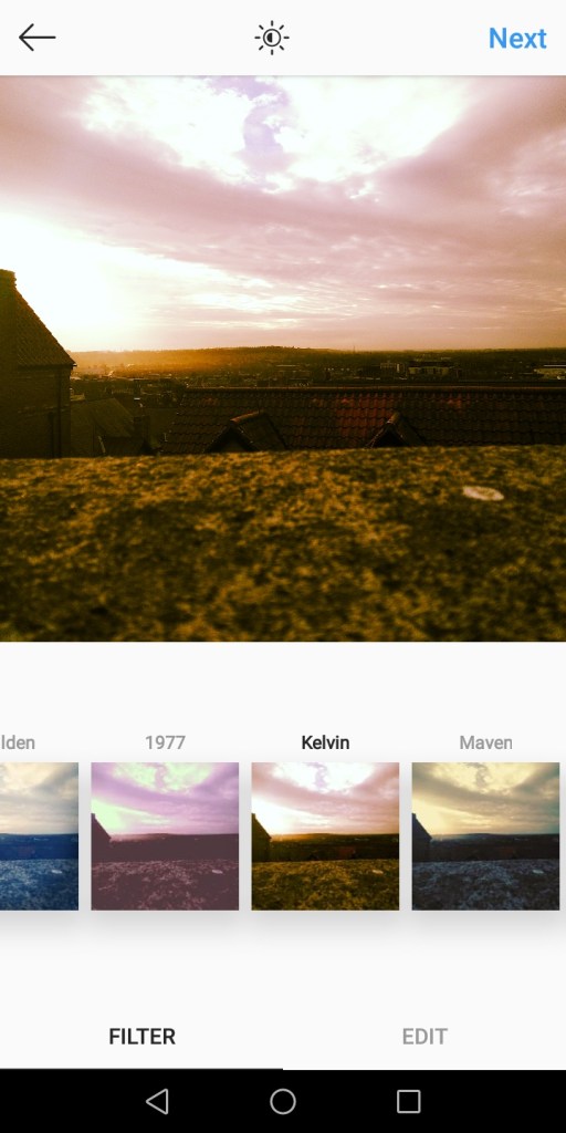
4th picture: Majority of the filters I chose, gives off a vintage feeling as I chose ones, that give gentle soft colours, but also brought in neutral soft tones, like browns and pinks, such as the filter “kelvin”
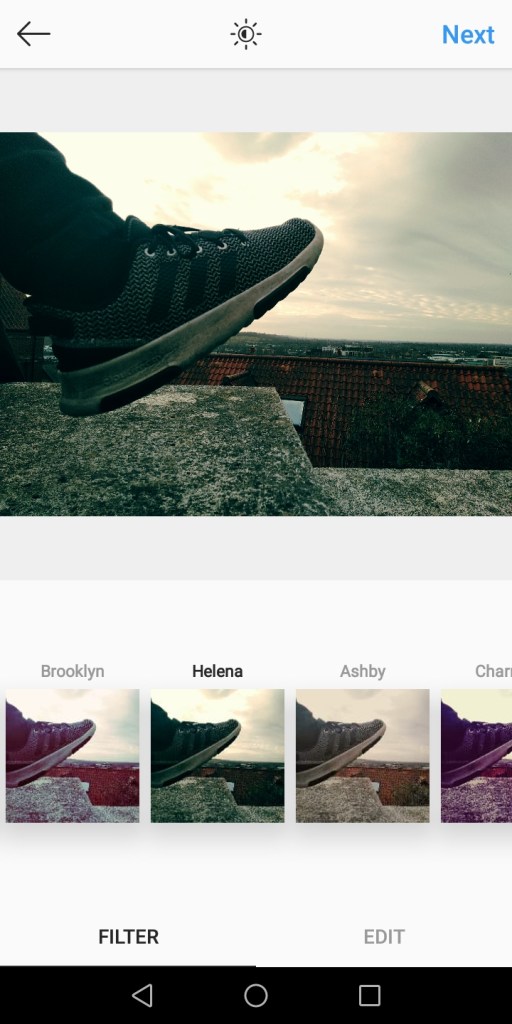
5th picture: Such filters like the “Helena filter brought out blues and golds in the sky, which made Callum look as though he was kicking and bursting out the colours from the sky. The black and white filter made it more melancholic and cast dark shadows.
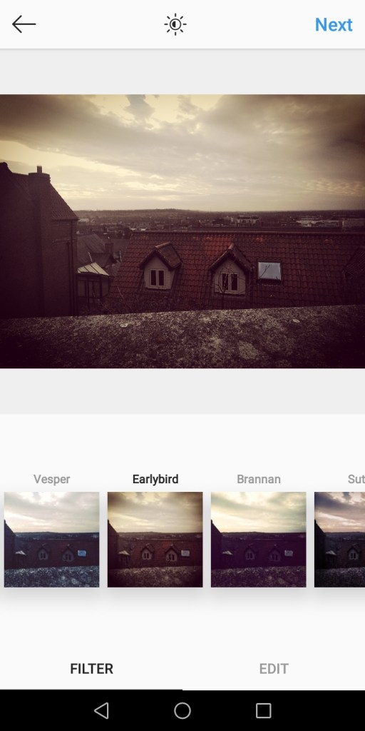
6th picture: Most of the filters i chose gave off a more natural and homey feel to them, bringing in pale greens and creams and making the brown tones of the roofs more warm and deep. Some filters, like “skyline” drew attention to the background of the photo but others like “Ashby” drew attention to the roof.
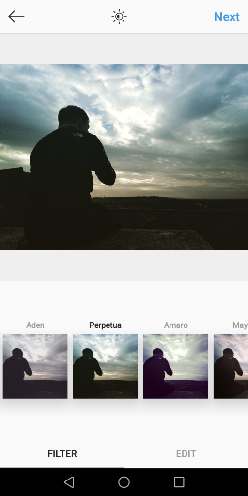
7th picture: I loved filters such as “perpetua”, that completely changed the colour of the sky into a blue and green tinge mixed with gold and made the silhouette of Callum stand out as strong and more dark. Also “lark” made the colour of the sky a pastel lilac and gave the image a more dainty and gentle outlook.
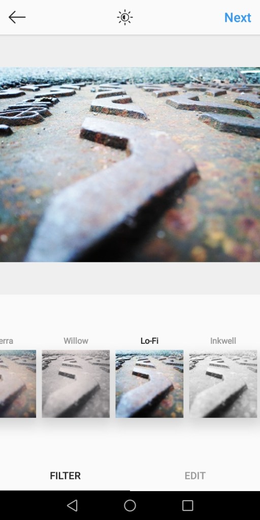
8th picture: Filters such as “Juno” made the detail stand out as bold and with more strong saturation, along with the filter “Lo-fi” which brought more contrast out and colours.
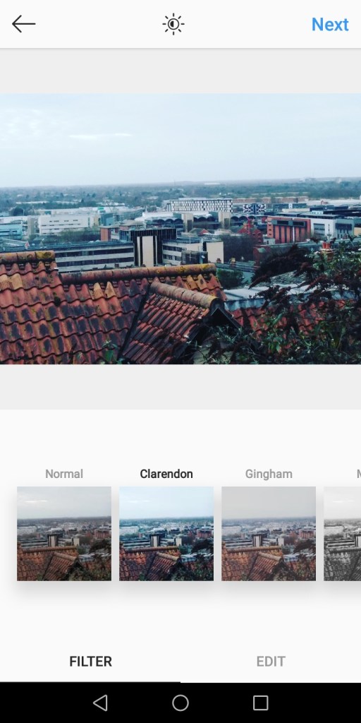
9th picture: I love the filter “Clarendon” for this, because it made it all much brighter and vibrant with the colours and gives it off as more positive, whereas the filter “moon” made it more of an old outdated feeling to it and more gentle.
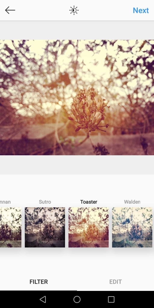
10th picture: Filters such as “Toaster” which brought out a lot of golden light onto the main subject and made everything else in the background lose colour and fade out.
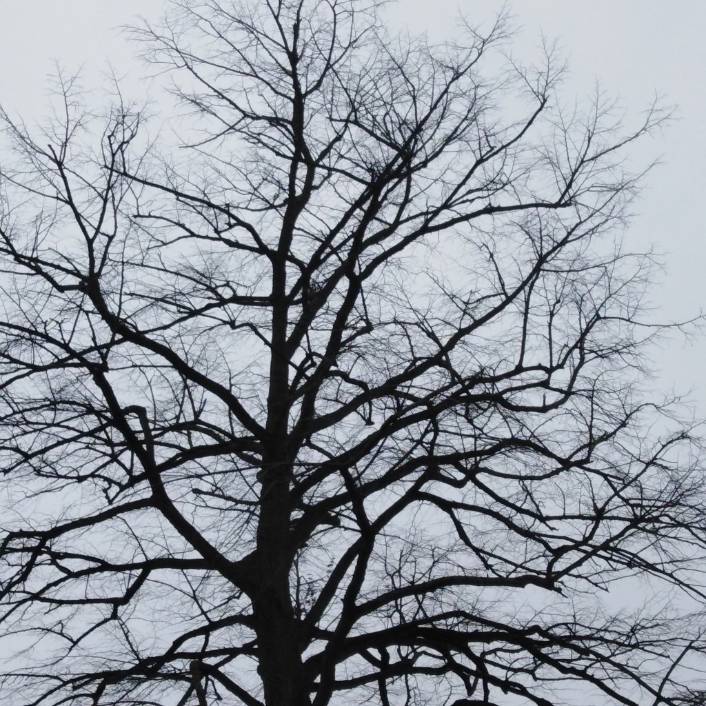
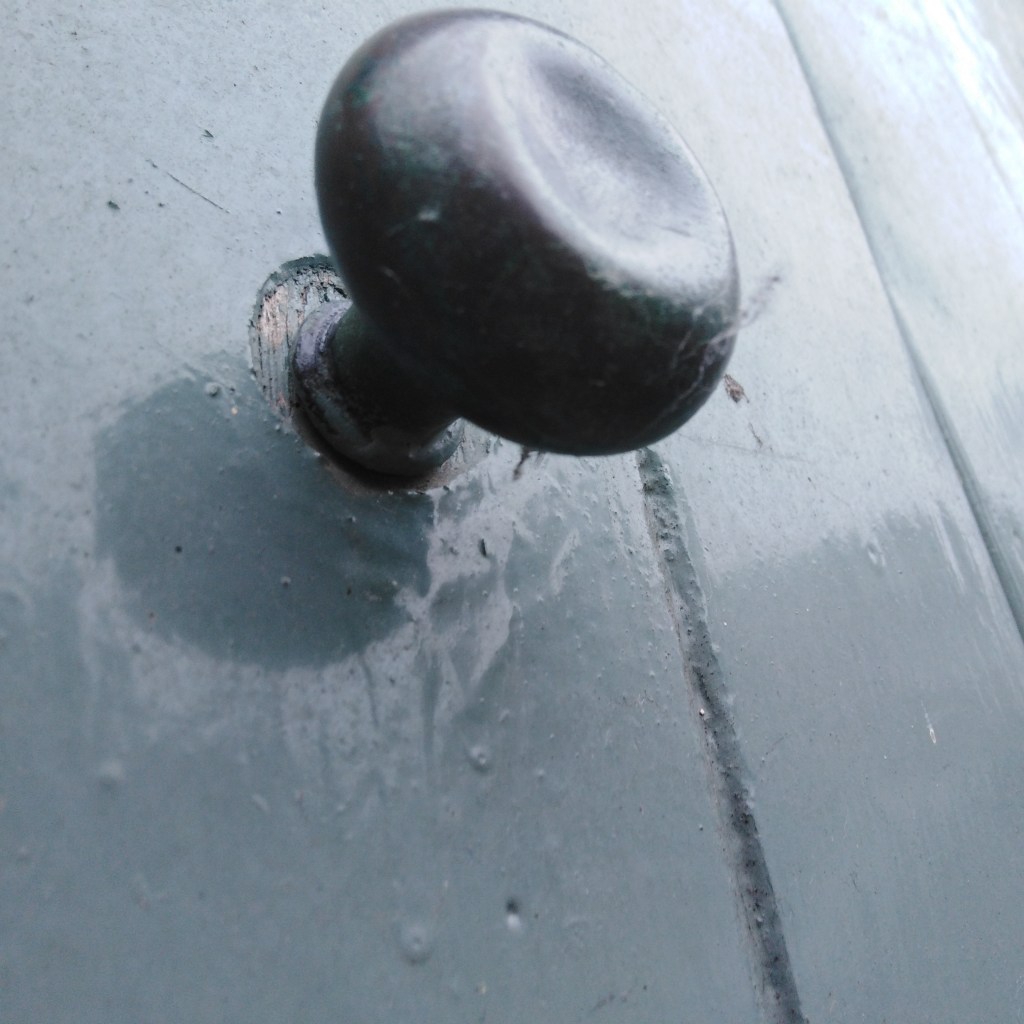
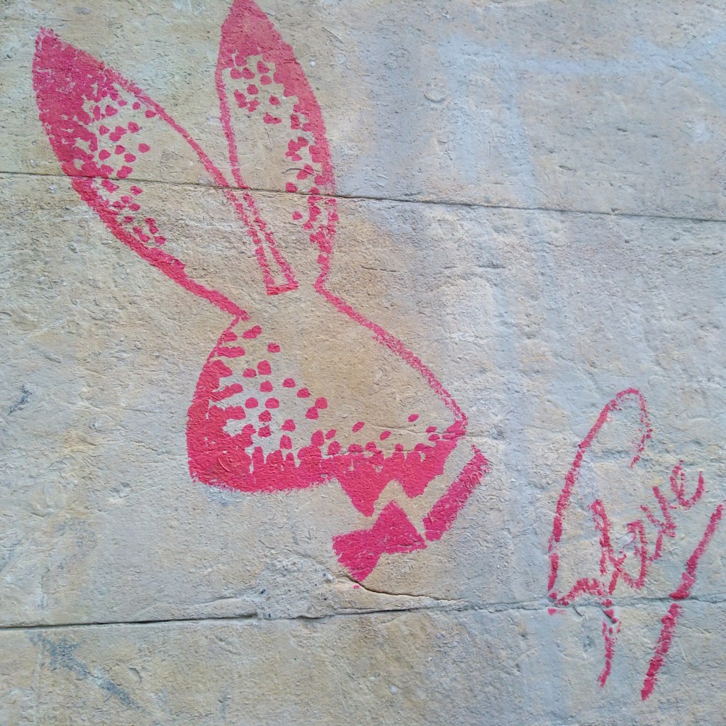
One of my fairly best shots of negative space. Here I took a shot of a tree with the sky almost sinking into the spaces of the tree branches which give off a silhouette effect. The tone and colour of the picture is quite dark and murky which creates a melancholic atmosphere which I feel created emotions within the picture. I feel as though i should of stood more further back however, to allow more negative space in the shot so it has a bigger impact and effect.A shot took of a door knob, everything is painted in a creamy soft pastel green. However the door knob being the 3D subject and strikes out from the flat painted structure behind being the negative space. To me it strikes out as an oddly satisfying picture which I feel like is due to using negative space. I could of improved by centering the door knob more in the middle so it’s more simplistic and the subject is more clear.Shot took of graffiti art. The strong vibrant pink of the rabbit stands out strong as the plain murky cream background is left as negative space which brings out the graffiti more to the eye. Again i could of centered more in the middle and it would of looked a lot more pleasing to the eye if it was a soft pastel colour behind like a pastel blue.
Here are 7 more of my most suitable shots that associate with negative space:
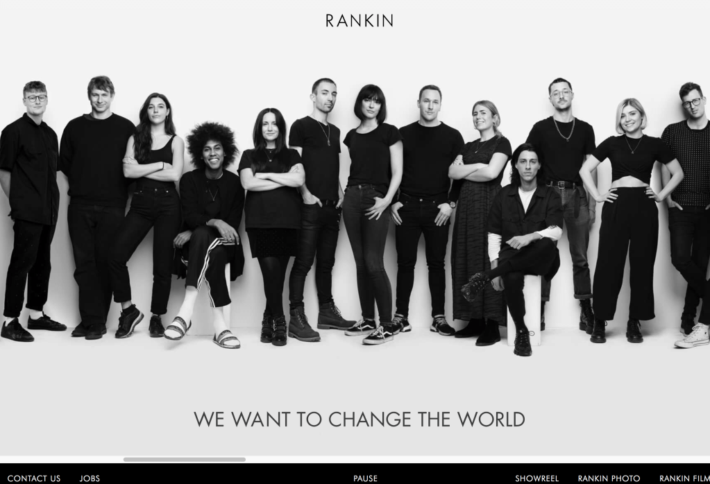
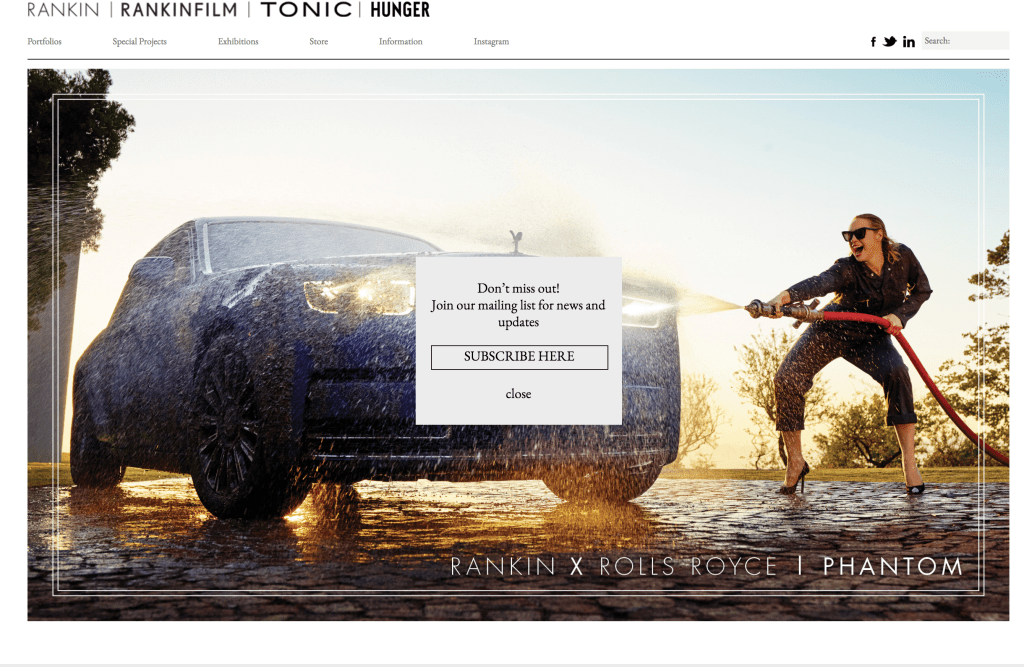
Layout: A moving sliding image is introduced to the viewer, which is quite a unique and different idea out there compared to other photographers websites i’ve seen. However, i’m not so keen on the idea of the keywords and different sections being at the bottom because i feel as though the moving image and words below clash a bit too much together so it’s confusing as to where to click and can confuse your vision, however there is an option to stop it from continuing to play. I t appeals to me how he uses the strong bold words he prints underneath the picture “we want to change the world” really captures my attention as the viewer. Includes stuff such as “rankin photo”, and “rankin film” which leads onto different sites showcasing his work. the background of his
Navigation:
It can be somewhat chaotic when wanting to view his pictures, as it all leads onto different sites for each thing, meaning constant tabs are being opened for everything which can be a bit too much. But other than that when clicking on certain sections it does lead you straight away onto the specific subject you wanted to view.
Communication:
I feel like the photographer, clearly expresses himself through the website and his passion for photography, simply by the words “we want to change the world” includes him and the models he does portraitures for all together, he wants people to perceive the world as a better place, by his photography and work of people. He communicates with the website as having a very strong person, and edgy character due to the bold black and white appearance of his background.
What would I potentially take from their website to improve mine?:
I would love to include strong bold phrases that express me as a person and my emotions. I want to create a powerful atmosphere and show that i want people to perceive the world as better by showcasing my work with expressions that match, like his own.
Main homepage, black and white made as a statement. Strong, bold and out there,his photos lead onto this different site here
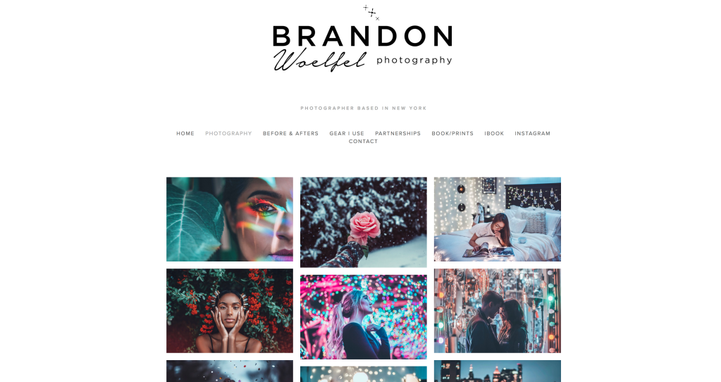
His layout – Simplistic, but not too simple and very organized. Kept the background a plain white colour, that makes the font of his name and the strong colour of his pictures that are in organized rows stand out boldly. There is very little text on the main homepage itself, I believe this would be to make his pictures stand out, as strong pops of colour bursts from the portraits. It inspires me a lot the way he has presented his pictures because of the contrast between his neon colours in the pictures to the white background it stands out more clearly, and because of how his pictures aren’t spaced out, it brings focus to each and every image next to one enough, but they aren’t too clumped in together leaving enough space, i feel as though if he did space out his pictures it wouldn’t look as aesthetically pleasing. He not only includes, his photography, but on other pages he includes, “before and afters”(editing), “gear i use”, “partnerships”, “book/print”, and more , all of these being super helpful to someone who is interested in his work. Before you access his main website, it comes up with one of his photos, with two icons below, suggesting if you want to see his portfolio or his instagram, which i find a really good idea, because sometimes people may be wanting to find their instagram portfolio or their website portfolio.
The Navigation:
The website is very easy to use and navigate through, including all the main sections and main keywords which is all at the very top of the website, so it’s easy to find and click on what you wish. there are about 9 pages i can access, all which work good and are easy accessible. You can click on the images he has on his homepage, and they appear larger filling the screen, which helps if you want to view it in more detail.
Communication:
His website really communicates well with the sort of photographer he is, because of the bold and neat layout, and easy navigation, he comes across as incredibly neat and organized, simplistic, yet knows what he’s doing and has the creative ideas for how things should be. He expresses his stye, which is fancy and bright throughout the website.
What would I potentially take from their website to improve mine? –
Personally, I would take the idea of presenting his pictures in row after row because i feel like it really brings the website better together, and feels and looks more neat. Also i love the idea of including the photographers name at the very top, in a font that expresses you. Like he brought out sparkles on the top of the name, which suggests how he uses a lot of lights, in his portraits and other shots.
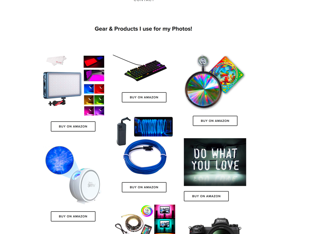
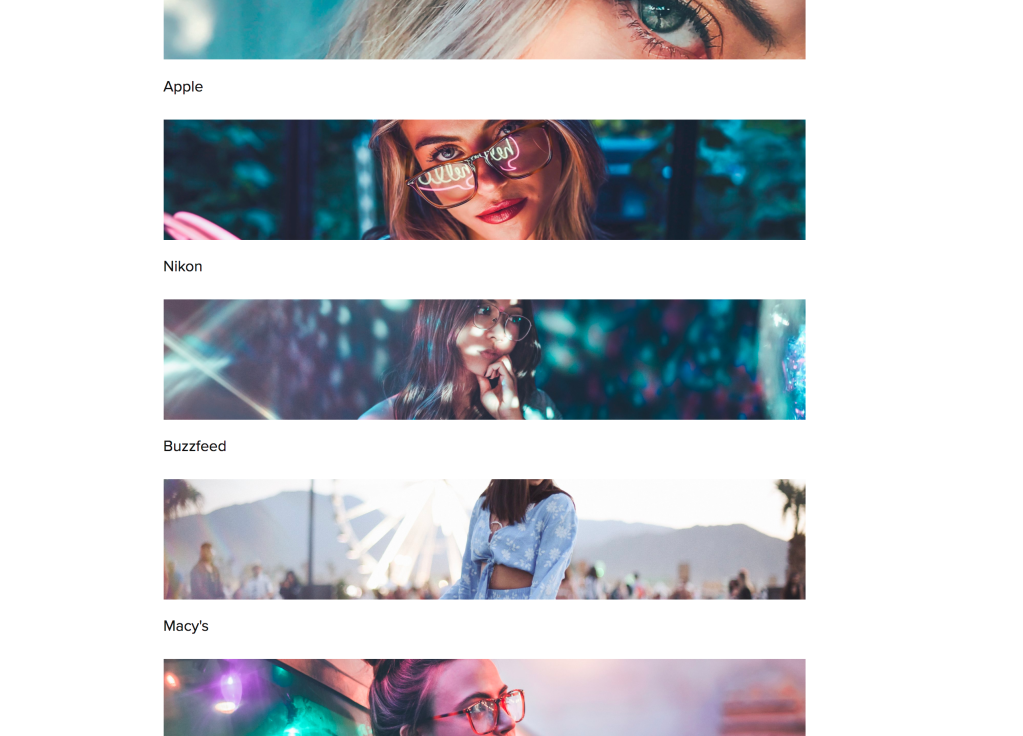
A very aesthetic, bold yet simple homepage layout. Includes gear and products he uses and where you can buy it from, which is extremely helpful for if you want to find out what he does to get specific shots. Includes his partnerships with leading brands, which shows how successful he is and persuades the viewer to get in touch with him and his work, or inspires people to have a great ambition and be successful like Brandon.