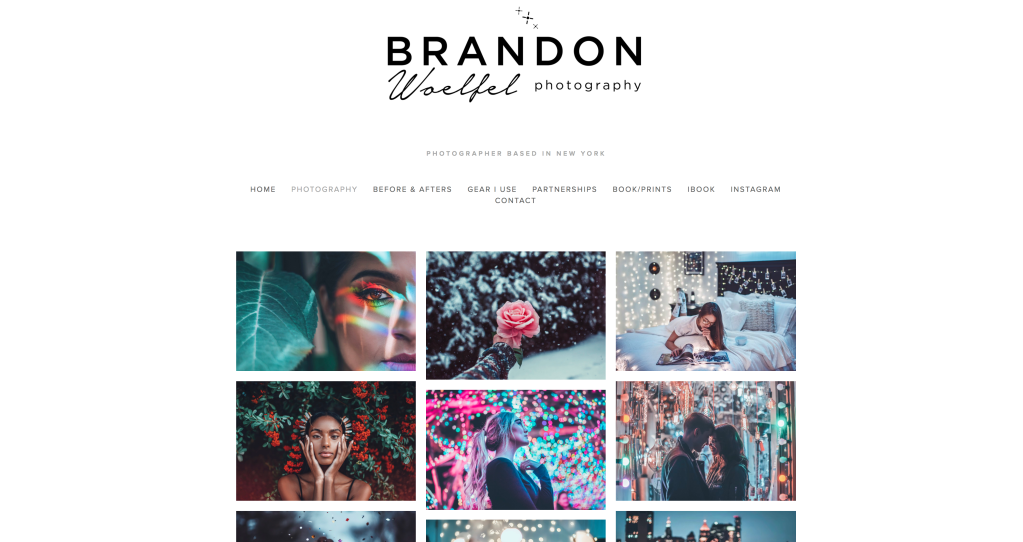
First photographer: Brandon Woelfel
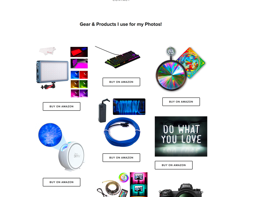
His layout – Simplistic, but not too simple and very organized. Kept the background a plain white colour, that makes the font of his name and the strong colour of his pictures that are in organized rows stand out boldly. There is very little text on the main homepage itself, I believe this would be to make his pictures stand out, as strong pops of colour bursts from the portraits. It inspires me a lot the way he has presented his pictures because of the contrast between his neon colours in the pictures to the white background it stands out more clearly, and because of how his pictures aren’t spaced out, it brings focus to each and every image next to one enough, but they aren’t too clumped in together leaving enough space, i feel as though if he did space out his pictures it wouldn’t look as aesthetically pleasing. He not only includes, his photography, but on other pages he includes, “before and afters”(editing), “gear i use”, “partnerships”, “book/print”, and more , all of these being super helpful to someone who is interested in his work. Before you access his main website, it comes up with one of his photos, with two icons below, suggesting if you want to see his portfolio or his instagram, which i find a really good idea, because sometimes people may be wanting to find their instagram portfolio or their website portfolio.
The Navigation:
The website is very easy to use and navigate through, including all the main sections and main keywords which is all at the very top of the website, so it’s easy to find and click on what you wish. there are about 9 pages i can access, all which work good and are easy accessible. You can click on the images he has on his homepage, and they appear larger filling the screen, which helps if you want to view it in more detail.
Communication:
His website really communicates well with the sort of photographer he is, because of the bold and neat layout, and easy navigation, he comes across as incredibly neat and organized, simplistic, yet knows what he’s doing and has the creative ideas for how things should be. He expresses his stye, which is fancy and bright throughout the website.
What would I potentially take from their website to improve mine? –
Personally, I would take the idea of presenting his pictures in row after row because i feel like it really brings the website better together, and feels and looks more neat. Also i love the idea of including the photographers name at the very top, in a font that expresses you. Like he brought out sparkles on the top of the name, which suggests how he uses a lot of lights, in his portraits and other shots.