Christina o’Brien:
Layout:
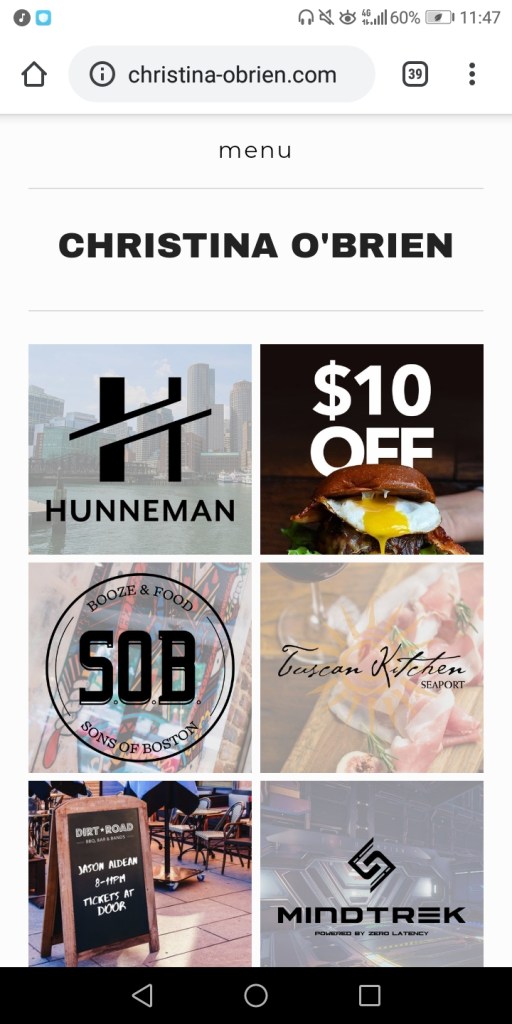
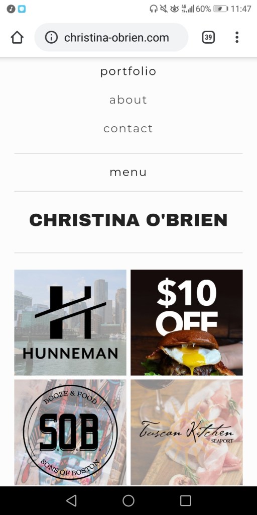
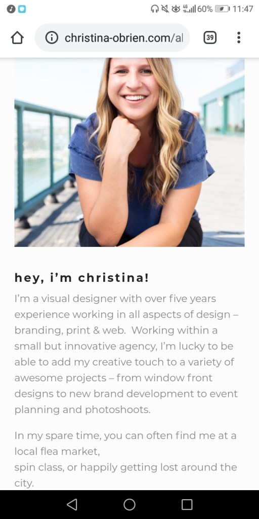
Pleasing and easy on the eye, basic, and minimalist (in a good way). She has set her photographs in rows and has made it clear that she does promotional photography, some of them being close-ups. So she has about 3 keywords along the top of her website (which is pastel coloured pink when hovering over, adding in small aesthetic details), she has “about” which includes a picture of her and a small but detailed enough amount of information about her and her photography. She also has “contact” which includes a map and her her contact information. I feel like the way she has put together her website, is very simple and easy but still has the little details that reveals the person she is behind the camera.
Navigation:
Super easy to navigate around due to the simple and easy layout of her website and how there are only 3 pages to access, yet includes everything we should want to know and click upon. It includes everything essential navigation wise which makes it really easy for everyone to use.
Communication:
I honestly feel as though her website strikes out the person who she is a lot, she loves everything to be organised, a minimalist, who is quite bubbly (due to the small pastel coloured, light details) and doesn’t like including too much that isn’t necessary, I feel as though it actually fits in too with the style of photography she does (promo), which is closeup and also minimalistic of what brand she is showing but also adds in the small details (like lights or the blur of other people) to make it more appealing to the eye.
What would I potentially take from her website to improve my own?:
Looking at her website really made me realise, how I don’t need to be including too much stuff, or at least the unnecessary parts and to include just mostly the essentials with small little details that are satisfying to navigate through or look at.