Morgan Norman
Layout:
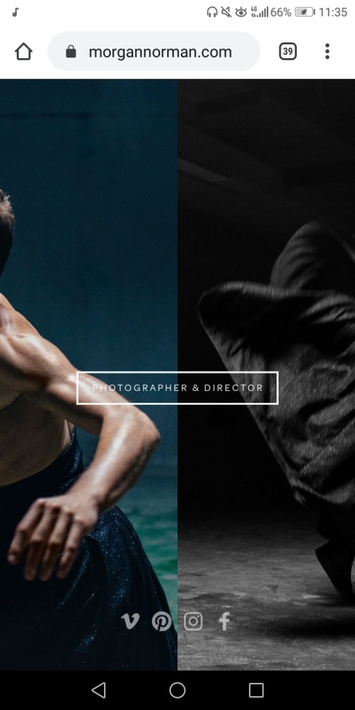
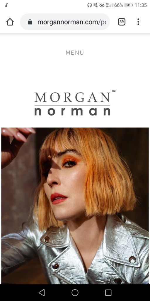
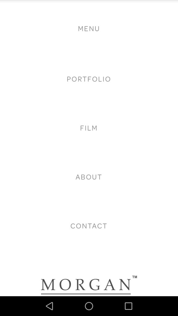
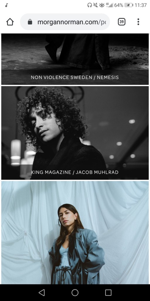
Firstly shows up with a main section that u click on first to access to his main website, which is much like the Brandon Woelfel website that I looked at. The first bit that shows up contains his social media contacts and then a small section that says “photographer and director” which leads onto his main website, I feel as though having this bit before the main website is actually useful because I feel as though social media should be on a separate part compared to the main portfolio which should be on the main website. Leading onto his portfolio where his photos are together and evenly spread out to the whole page but still leaving enough gaps and space for it to not become too much or too chaotic. The background is a plain black and white colour which helps his photographs stand out. His website layout is also quite simple with about 4 pages, which includes his film, about him (which includes a lot of information and a picture of him), his portfolio and his contact page.
Navigation:
The navigation for his website is very easy, it doesn’t lead you off on to other websites comes up with chaotic adverts or too many moving images or too much information which is incredibly helpful to anyone viewing or navigating through his website.
Communication:
It’s clear that the style of photography he does is edgy and bold portraits, as well as doing them for magazine covers, he’s very creative when it comes to taking it in a way that expresses the models personality which shows that he’s a very open minded photographer.
What would I potentially take from his website to improve my own?:
Possibly keeping the black and white background like he has, just to make everything not so chaotic and making my pictures stand out would be a suitable idea for getting across my own work.