I found that when using normal format it allowed more space into the shot and made the pictures seem more elongated compared to the square format.
Starting with my first picture (in square format) it seems more like a landscape shot due to the subject being more in the distance and, I feel as though I found it more easier to center my chosen subject by using the square format. When I look at the normal format shot of the same subject, it seems like it makes the houses and road seem more close and wider in comparison to the my first shot. I feel like by using the square format, it made it look more realistic as to how I saw the subject with my eyes, and how i wanted it to be perceived as, so therefore I feel as though i much preferred the square format for this shot and particular shot.
Coming to my second picture, the main subject I wanted the viewer to be drawn to was the house in the background which was why I used the branches and other houses to frame and make the house in the background appear. When using square format for this picture, I feel as though it made it more difficult for the house in the background to stand out, as the square format squished it all in to make the house in the background blend with the others and appear smaller in size, however compared to the one with normal format, it brings the subject more close to the eye and stands out. So i prefer normal format for this shot
Moving onto shot number 3, It seems a lot more close and focused upon the raindrop falling off the branch which is in normal format (I prefer this one) compared to the one in square format which seems more framed and focusing on the branches as a whole.
When viewing my 4th picture, you can see the whole of the light through the window and because of using square format, it focuses on everything as a whole and really draws attention to the reflection on the window as well as the light that is casting on it; compared to the one with normal format, it draws more attention to the main light only. But personally, i find the square format much better as it offers more to the eye in the first shot.
Coming to my 5th picture, I tried framing the main subject of the picture (the light) by using the leaves, however, when using the normal format I found it more difficult to center the light in the gaps of the leaves however with square format, it made it much more easier and stood out better.
Overall, to me, the main difference between square format and normal format on phone cameras, is that square format focuses on bringing things more close and up personal and tends to take the shot as how you perceived it through the eye but when it comes to normal format, it makes everything further in the distance, and makes sure that everything has fitted into the picture, by that, I see normal format as definitely more reasonable for landscape shots, where you want to the viewer to see everything surrounding you, and square format shots are great if you want the viewer to focus on one or two specific things in your picture.
Some other photos I have in square format that were took that day:
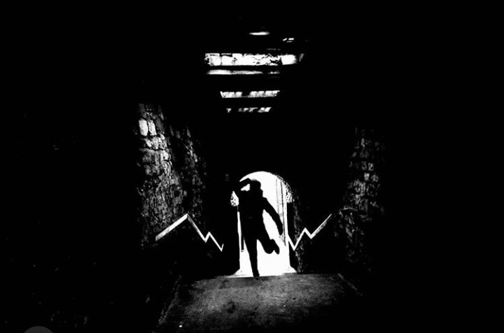
A black and white shot, with a silhouette of Callum. The square format really helped with emphasizing and bringing forward the silhouette and making it more clear to the eye and due to the square format it assisted with positioning Callum bang in the middle, giving a good composition. This shot seems really eery and sinister which can draw attention to most viewers.
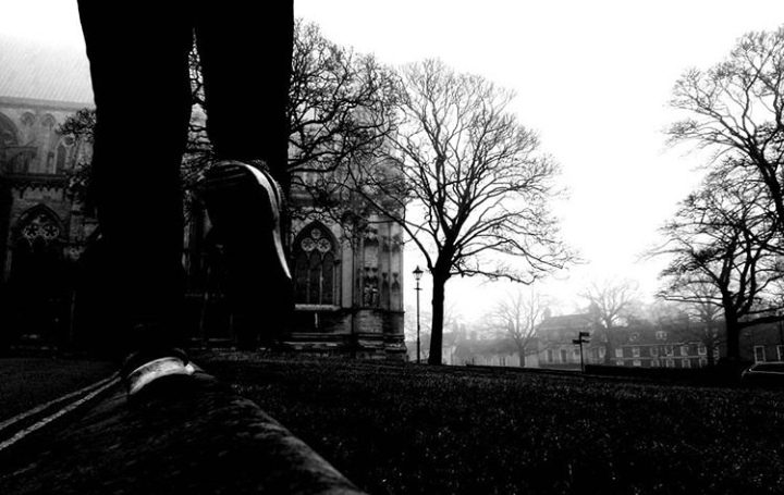
Square format really suited to this shot, which is a ground level black and white view of Callum (again), it helped bring the main subject of the shot more close (the legs) and keeping everything else contained and clear within the image (the background). I admire the misty unknown sense that the atmosphere gives in this shot.
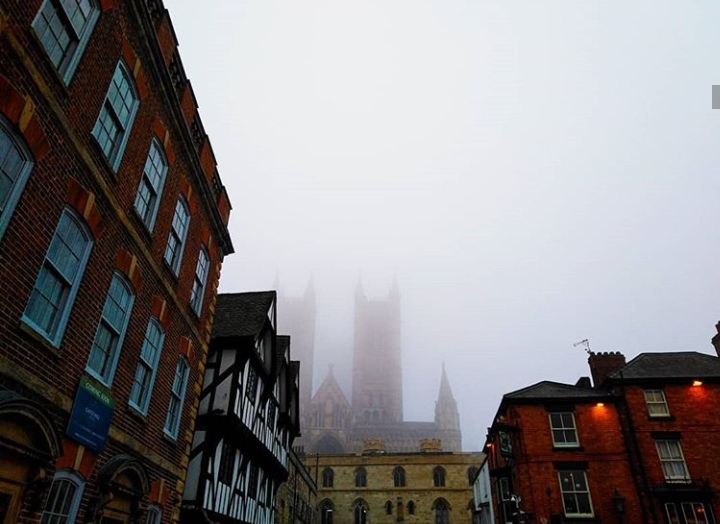
Compared to the shot of this in normal format (unfortunately i lost the image for that one, so I can’t compare) the square format for this shot made the buildings on the left lean in a lot more, yet made everything evenly proportioned in the image and not so abnormal. It helped with the framing of the misty foggy castle in the background, which creates a pleasing image to the eye.
Square format was very useful for compositing the castle so it fit in all around the image, like it was opening up to the viewer so you can see all the different abstract shapes and different heights of each bit it has to offer. I did apply a filter to this shot so it could give it a more vintage and out dated feel.
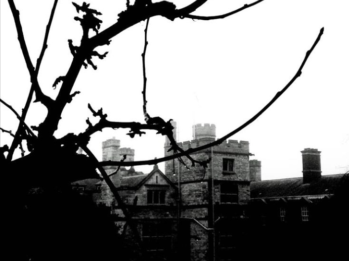
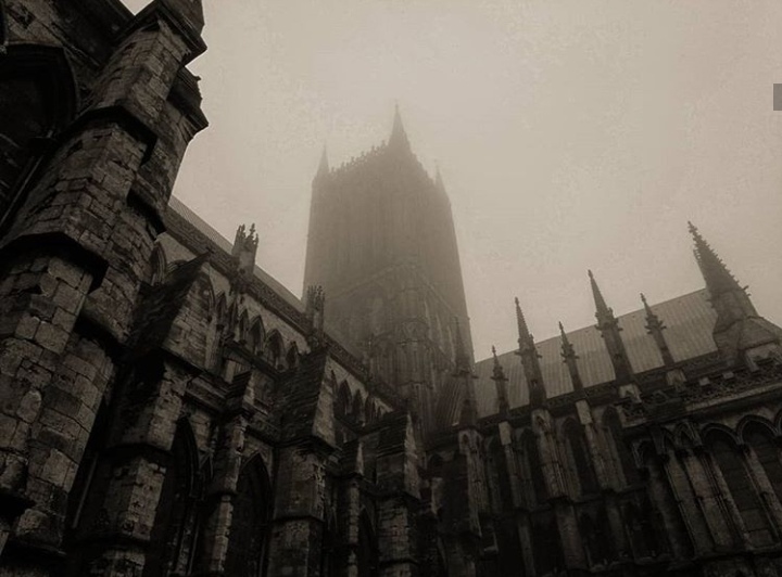
Square format for this shot in particular helped with the elongated twisting silhouetted branches framing the castle. I find that using square format for this helps with the rule of thirds for this also so it makes the shot a lot more appealing to the eye.
A picture without square format:
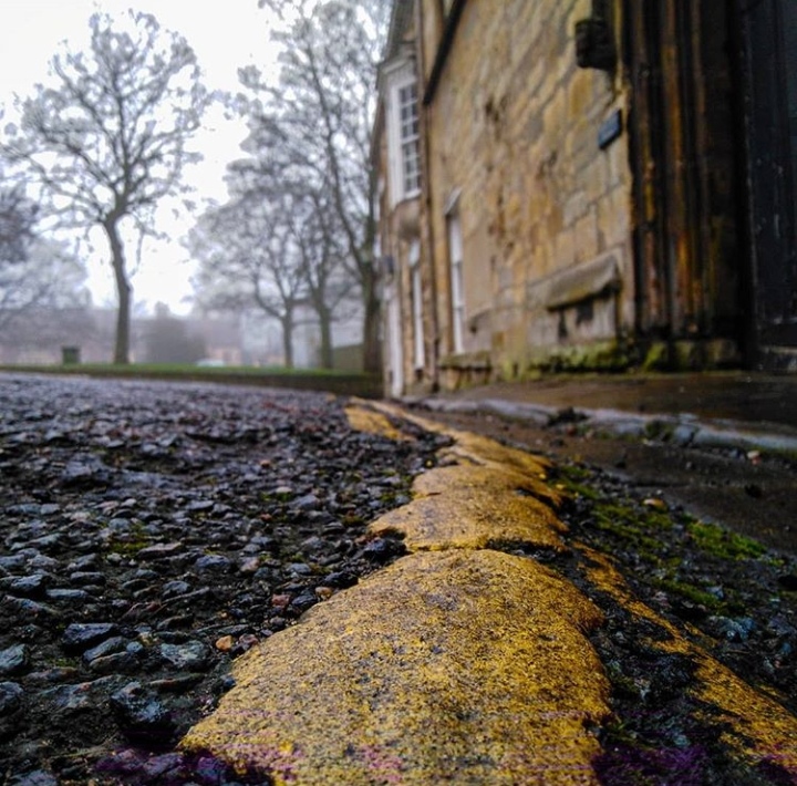
I feel like when taking pictures in normal format for leading line photos, it makes them turn out a whole lot better as it makes the shot seem more abnormal and allows a whole lot more in the image so it becomes a proper leading line photo. This shot is appealing to the eye for some due to the vibrant yellow line that leads to the misty background with trees and a building.
