1st GIF made at home:
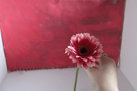
I am quite satisfied with how this turned out as my first GIF. There are some things that I could’ve improved upon such as: Using the space more effectively rather than just moving the flower around, I could of kept changing the background colour constantly and made sure the petals were scattered all over the bottom to cover all of the space. I feel as though setting the time frames to 0.5 secs rather than 1 sec (the usual time I select) as it made it flow more naturally and quicker as using 1 sec for the time frames made it a lot more slower and not looking so much like a proper GIF.
2nd GIF made at home:
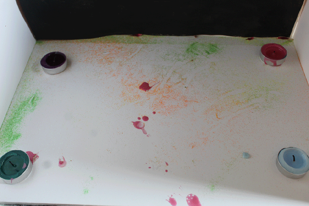
I do much prefer the first GIF over this second one, as I feel as though this one turned out pretty messy and it isn’t very appealing or entertaining to the viewers’ eye. I believe I should invest in a tripod for my future GIFS, as my camera moved alongside with the candles. Even though I used glitter for this GIF, it doesn’t look very great to the eye. It was easy to make on photoshop and flows through each frame with ease due to me setting it at 0.5 seconds per frame.
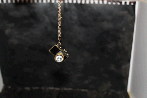
I believe I included personification when making this GIF, as I focused on trying to create shapes and movement with the necklace chain to give it more of a personality, being mischievous when taking the shot closeup (i used my flash) and going back. It didn’t quite work out when i was hoping for it to be apparent that it was taking a picture, as the flash actually made it stand out better and the black more of a deep black with no spaces left where i painted the card, so in terms to improve this GIF i could of just shot it all with flash instead of natural lighting and to make it look like it took a picture I could of researched into better alternatives to secure my idea of that.
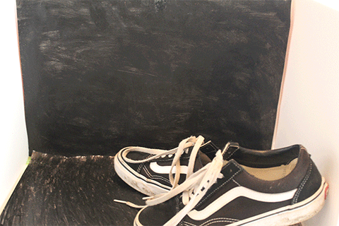
I believe I prefer this GIF compared to the one with the necklace because there is more of a creative idea to it when the rose is involved along with spelling out the words “love” with the shoelaces. Although I didn’t use a light blue shade of a background, I decided that keeping the black and white made my vans shoes stand out amongst it and the red rose stand even better and in better contrast with the bright red against black. It would’ve been better if i had a tripod so the cube space wasn’t moving too.
